A Foot in the Door
A Foot in the Door is a next generational job-search platform aimed at job seekers with 0 - 5 years of professional experience. They aim to provide a space where recent graduates or career changers can utilize video, social media, and epic profile boosting features to showcase who they are to employers.
In this project I used my skills as a hands on project manager to lead a team of 4 designers. This project optimizes the user experience for job seekers while improving user engagement, satisfaction, and retention.
Project Overview
PROBLEM
‘A Foot in the Door’ seeks assistance in optimizing the user flow for job applicants while maintaining their current design style.
SOLUTION
Use user research to design an updated AFITD website that fixes usability flaws and drives engagement
Present a list of design recommendations to the team
ROLE
Project lead for team of 4 designers
TIME
2 week design sprint
TASK
Improve the user experience for job-seekers
TOOLS
Heuristic Analysis, Competitive Analysis, User Interviews, Affinity Mapping, Contextual Inquiries, Sketching, Wireframing, Prototyping, Usability testing
Through research, our team wanted to:
Learn what features are common among popular job boards
Identify UX violations present on the AFITD site
Discover the goals, needs, motivations, and frustrations of AFITD’s users
Validate direction through contextual inquiries
Empathize
Research
Taking a look at AFITD’s competitors I selected 5 top job board’s to evaluate. These included LinkedIn, Glassdoor, Monster, Indeed, and Zip Recruiter. I wanted to compare the strengths and weaknesses of each to see what a mainstream job board needs to succeed but also if there was any place for AFITD in the current market.
Competitive analysis
Competitors
Strengths
Extensive Network
High-Quality Job Listings
Content Sharing
Weaknesses
Competition
Premium Features
Expensive for Employers
Strengths
Company Insights
Transparency (salary, employee reviews)
Variety of listings
Weaknesses
Smaller job pool
Requires an account
Strengths
Resume database
Diverse job listings
Advanced search options
Weaknesses
high volume of applicants
Less appealing UI
Strengths
Detailed search filters
Resume Download
Job Alerts
Weaknesses
Limited networking
Posting Accuracy
Strengths
One-Click apply
Job Alerts
Mobile-Friendly
Weaknesses
Varied quality of job posts
limited networking
We also administered 10 contextual inquiries aimed to uncover the intricacies of job applicants' interactions within the site. By witnessing firsthand how users navigated the platform, their pain points, and their moments of success, we were able to collect qualitative data that would inform design decisions.
Utilizing Usertesting.com we focused our testing on users with recent job search experience. This method provided both audio and video responses to each task, which are detailed below.
Contextual Inquiries
Navigate to the '“Job Center”
Create a Profile
Find Job Posting Details
*Videos from test participants
Define
During our research, we encountered a diverse array of job seekers, but I deliberately shifted my focus towards recent graduates entering the job market. This choice was driven by my intention to avoid designing on my personal experiences. This strategy allowed us to adapt and enhance the platform, creating an inclusive and efficient user experience that extended beyond my personal viewpoint.
Centering on the User
To better visualize the total experience of a recent graduate on AFITD I created a journey map. Informed by in-depth user interviews and contextual inquiries, it illuminated key touchpoints, emotions, and decision-making moments users encountered while navigating the platform. It also served as a powerful tool for aligning our team's efforts and driving user-centered decisions throughout the project, ultimately resulting in an enhanced user experience.
Journey Map
Ideate
Blending the competitive analysis, user research, and contextual inquiry insights, we formed solutions that included industry best practices, genuine user needs, and real-world authenticity. This synthesis yielded design solutions firmly rooted in user-centricity, with a focus on recent graduates.
Exploring Solutions
Based on the feedback and pain points, our priorities included
Streamlining navigation
Expand the onboarding process
Enhancing job search filters and indicators.
Reformat job posts
Streamline Navigation
Clear up inconsistencies
Show users where they are on the site at all times
Limit opening new tabs
1
Expand the onboarding process
Begin onboarding immediately after profile creation
Detail each part of ‘My Dashboard’
Give user’s the freedom to exit at any point
Enhancing job search filters and indicators
Add a clear all button
Eliminate single check boxes
Reword confusing options
Reformat job posts
Make text easier to read
Change company link to side panel to avoid user confusion
Move apply CTA to top of post
4
3
2
Now that the problems defined had tangible solutions, I collaborated with the project design lead to convert our sketches into high-fidelity mockups. This allowed us to visualize changes immediately before moving each frame into a working prototype.
Changes Visualized
Prototyping and testing
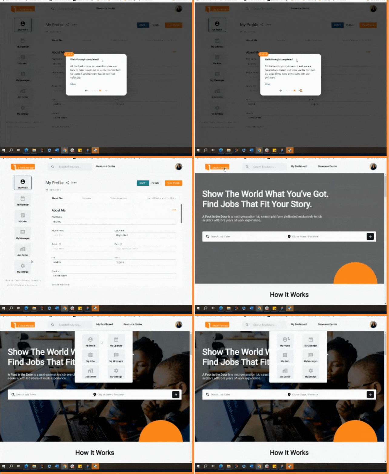
Only shown when navigating to ‘My Dashboard’
Limited explanations
Unable to exit
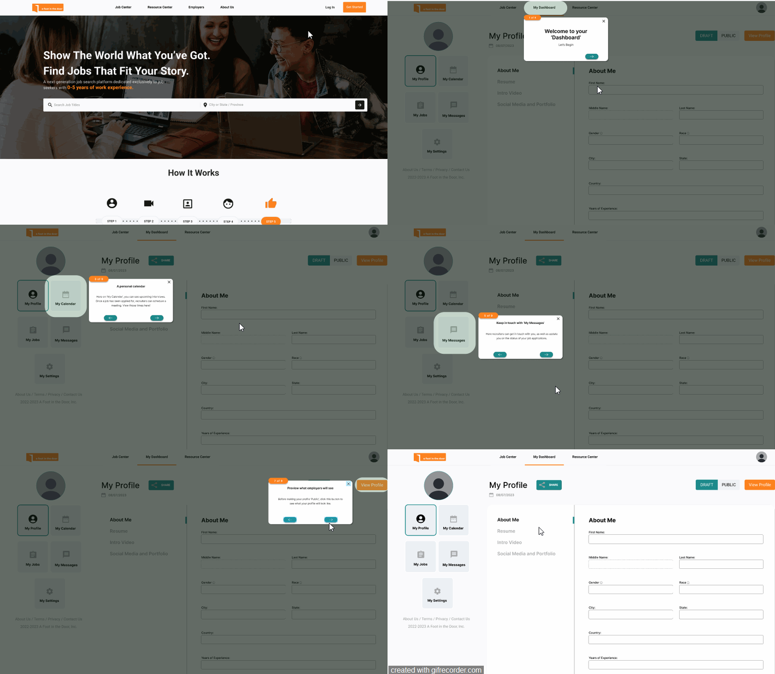
Onboarding
Begins directly after sign up
Added Welcome, My Profile, My Calendar, My My Jobs, and My Messages cards
Ability to close out at any time
Revamped Onboarding
My Dashboard
‘Job Center’ lost among cards
Inability to write in text fields
Unclear system status
Hidden Share feature
Revamped Dashboard
Moved ‘Job Center’ to global navigation
Allow text field input
Clearly defined location
Improve CTA UI for share feature
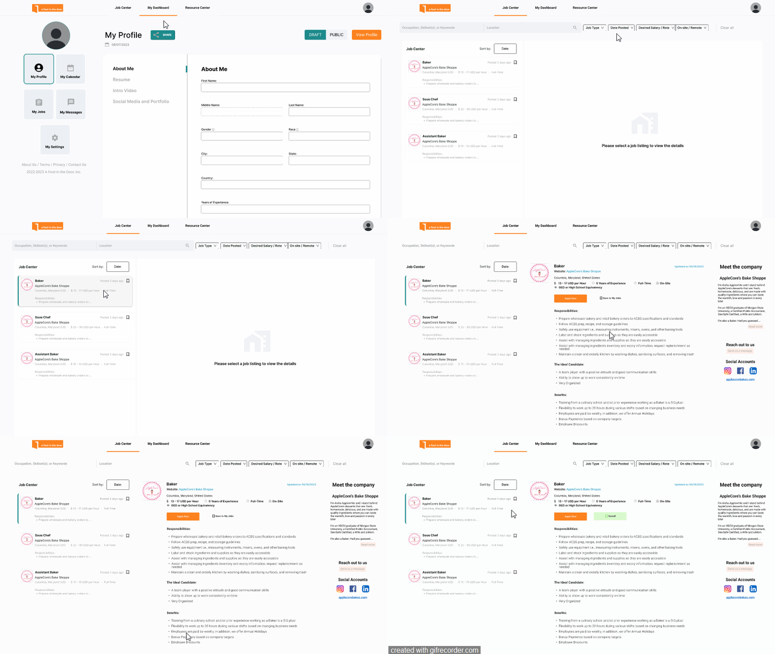
Separate link on posting card
Apply disappeared below scroll
Unorganized filters
Unclear system status
Job Center
Revamped Job Center
Moved Company information to side panel
Adjusted CTA location and text formatting
Improved filters to match competitors
Clearly defined location
The end product is a streamlined and user-friendly prototype that seamlessly integrates user needs, industry best practices, and the real-world experiences of our users. It was a culmination of our commitment to user-centric approach, resulting in increased user engagement, satisfaction, and retention.
Final Prototype
Set Up for Success
Find Your Perfect Job
My role as the project lead for 'A Foot in the Door' has been a journey of self-discovery and professional growth. Focusing on recent graduates among our users provided me with fresh insights and perspectives, distinct from my own experience. This connection reinforced the importance of empathy in design, highlighting that understanding diverse user experiences is at the core of creating meaningful solutions.
Furthermore, this project underscored the value of collaboration. Working closely with our researchers and design lead illustrated the collective strength of our team in developing user-centric solutions. It reinforced the leadership skills I have developed throughout my professional skills in bringing a team together to reach a common goal.
Reflection
Continuous Testing
Since the website is already live, it’s important to track metrics to better define what features are working and what still needs to be improved. KPI’s such as job post engagement, user conversion rates for job applications, and new account registration numbers will all give insightful quantitative data on the website’s performance.
User feedback and satisfaction is also critical in an industry with so many competitors and sending out a brief satisfaction survey to current users would also be a smart way to gauge usability.
Next Steps
Browse another project
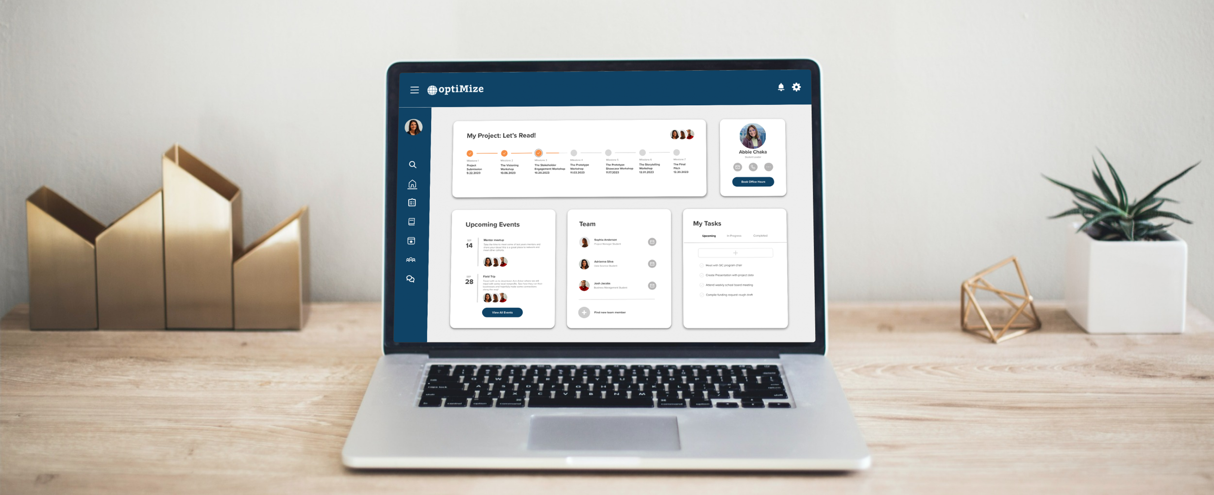
OptiMize


